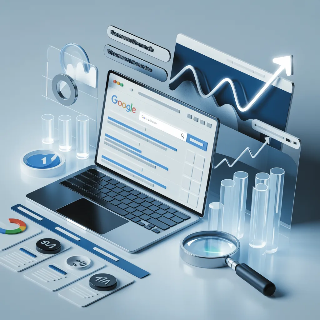
Many website owners check Google Search Console every day on a regular basis, review clicks, impressions, average positions and CTR percentages and hit the close button without making any changes. It’s not that there’s no data; it’s that there’s no information.
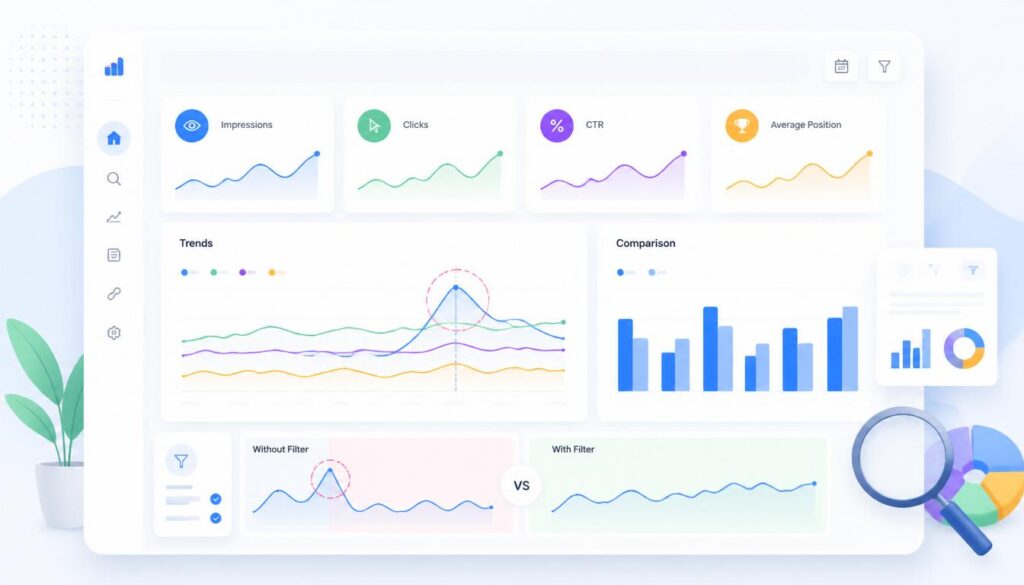
Often raw data is not sufficient on its own. A spreadsheet with hundreds of rows can get very cumbersome. Patterns, however, start to become more apparent when these same pieces of information are presented in charts, graphs, pie charts, heat maps and dashboards.
Creating pretty reports is not the only use of data visualization for SEO. It’s about how you break down a lot of information into something that matters and can help you improve your rankings, drive more traffic, and bring in new growth opportunities.
One time I saw a page getting thousands of impressions with very few clicks on it while using the data from Search Console. Initially, the content was not very exciting. But once the data was presented in charts and graphs, it was clear that there was a real problem: rankings didn’t change but CTR continued to drop. In a few weeks, clicks began to rise and the entire article was not rewritten, but the page title and the meta description were improved.
Table of Contents
- Search Console Metrics and What They Mean
- Why Raw Search Console Numbers Can Be Misleading
- Visual SEO Reports That Reveal Hidden Opportunities
- Trend Line Charts
- Heat Maps
- Pie Charts for Traffic Distribution
- Position Distribution Charts
- Real Example: Turning Search Console Data Into SEO Growth
- Best Tools for SEO Data Visualization
- Turning Insights Into Actions
- Conclusion
- FAQs
Why Raw Search Console Numbers Can Be Misleading
SEO reports can sometimes create confusion because numbers without context do not explain performance behavior.
Imagine a page showing these results:
- 30,000 impressions
- 400 clicks
- 1.3% CTR
- Average position of 7
At first glance, someone may assume the page is underperforming because click numbers appear low. However, placing this information into a visual line chart may reveal something completely different.
The chart could show:
- Impressions increasing consistently every week
- CTR gradually decreasing
- Rankings remaining stable
This changes the interpretation entirely. Search visibility is growing, but users are choosing other results instead of clicking yours. Instead of rewriting the article from scratch, the better decision may be to improve the page title and meta description. Visualization eliminates unnecessary work as it helps to determine the real problem.
Visual SEO Reports That Reveal Hidden Opportunities
Trend Line Charts
Trend lines are used to determine if traffic patterns are increasing, decreasing or staying constant over time. For instance, a fitness site sees an uptick in impressions on the keyword “home workout plans.
Over three months:
- Month 1: 8,000 impressions
- Month 2: 10,500 impressions
- Month 3: 13,200 impressions
A trend line clearly shows increasing search interest.
This trend creates an opportunity to expand content around related topics:
- Home workout plans for beginners
- Weekly home exercise schedules
- Essential home workout equipment
Instead of randomly publishing content, trend visualization helps guide content strategy.
Heat Maps
Heat maps help identify performance differences across devices, countries, or page types.
Consider this example:
| Device | Clicks | CTR |
| Desktop | 2,100 | 4.5% |
| Mobile | 1,200 | 1.8% |
The heat map immediately highlights weaker mobile performance. Without visualization, these numbers could easily be overlooked.
Possible improvements include:
- Faster loading times
- Better mobile design
- Larger font sizes
- Improved button placement
- Reduced visual clutter
Small changes often produce noticeable improvements in user engagement.
Position Distribution Charts
Keyword rankings become difficult to analyze when you have hundreds of terms listed individually.
Position distribution charts simplify the process.
Example:
| Ranking Range | Number of Keywords |
| Position 1–3 | 18 |
| Position 4–10 | 46 |
| Position 11–20 | 105 |
This report immediately reveals that many keywords are sitting on page two of search results. That creates an obvious opportunity.
Instead of focusing only on new content creation, you can:
- Strengthen internal links
- Update content sections
- Add missing information
- Improve keyword relevance
Pushing page-two keywords upward often requires less effort than ranking entirely new pages.
Real Example: Turning Search Console Data Into SEO Growth
A small technology blog published an article called:
Best Budget Laptops for Students
After sixty days, Search Console reported:
| Metric | Value |
| Impressions | 18,500 |
| Clicks | 320 |
| CTR | 1.7% |
| Average Position | 8.4 |
The numbers did not immediately indicate a problem.
After visualizing the data through a dashboard, several patterns appeared:
- Impressions were increasing every week
- Mobile CTR was significantly lower
- Most traffic came from unexpected keyword variations:
- affordable student laptops
- cheap laptops for online classes
These insights also revealed several low competition keyword opportunities that were not originally targeted in the article.
The website owner made several changes:
- Updated the article headline
- Added FAQ sections targeting discovered queries
- Improved mobile speed
- Added internal links from related posts
After forty-five days, results improved:
| Metric | Before | After |
| Clicks | 320 | 810 |
| CTR | 1.7% | 3.9% |
| Average Position | 8.4 | 5.2 |
The article itself did not undergo major changes. The improvement came from understanding what the data revealed. This demonstrates how visualization converts numbers into actions.
Best Tools for SEO Data Visualization
Several tools can help create visual SEO reports.
Google Looker Studio
Useful for creating custom dashboards connected directly with Search Console.
Google Sheets
A simple option for creating charts and identifying patterns.
Excel Dashboards
Helpful for managing medium-sized datasets with visual reporting.
Power BI
Suitable for advanced reporting and large amounts of SEO data.
Tableau
Useful for organizations handling extensive data analysis. The ideal tool depends on reporting needs and the amount of available data.
Turning Insights Into Actions
Data alone does not improve rankings. Actions do.
A practical workflow looks like this:
- Collect Search Console data
- Create visual reports
- Identify unusual patterns
- Discover opportunities
- Make SEO improvements
- Track performance changes
Following this process helps transform reports into measurable growth.
Conclusion
There’s valuable information in Google Search Console already. To collect more data is not the challenge, the challenge is to know what the data is actually showing. Visual reports can reveal patterns and relationships that are not easily apparent in the raw data. Instead of asking, “How many clicks did I get?”, a better question is, “What story is the data telling?”
This attitude is particularly crucial in the case of effective SEO strategies for new websites. Small performance trends are not as noticeable when websites are in early stages and have limited traffic. By visualizing the data, you can start to find new keyword opportunities, pages with poor click-through rates, mobile usability issues and even gaps in content before they become a serious problem.
That small shift changes SEO reporting from passive observation into active growth.
FAQs
What is data visualization in SEO?
It converts SEO data into charts and graphs to make trends easier to understand.
Why is Google Search Console useful?
It shows clicks, impressions, rankings, and user search behavior.
How does a pie chart help in SEO?
A pie chart represents the percentage of traffic for each category, device or page.
Which SEO metrics should I track?
Focus on impressions, clicks, CTR, average position, and search queries.
Which tools are best for SEO data visualization?
Google Looker Studio, Google Sheets, Excel, and Power BI are popular choices.
Can data visualization improve traffic?
Yes, it helps identify opportunities and supports better SEO decisions.