
Many website owners check Google Search Console every day on a regular basis, review clicks, impressions, average positions and CTR percentages and hit the close button without making any changes. It’s not that there’s no data; it’s that there’s no information.
Often raw data is not sufficient on its own. A spreadsheet with hundreds of rows can get very cumbersome. Patterns, however, start to become more apparent when these same pieces of information are presented in charts, graphs, pie charts, heat maps and dashboards.
Creating pretty reports is not the only use of data visualization for SEO. It’s about how you break down a lot of information into something that matters and can help you improve your rankings, drive more traffic, and bring in new growth opportunities.
One time I saw a page getting thousands of impressions with very few clicks on it while using the data from Search Console. Initially, the content was not very exciting. But once the data was presented in charts and graphs, it was clear that there was a real problem: rankings didn’t change but CTR continued to drop. In a few weeks, clicks began to rise and the entire article was not rewritten, but the page title and the meta description were improved.
The Page That Looked Fine Until It Didn’t
A client’s article was sitting at 30,000 impressions a month, 400 clicks, a 1.3% CTR, and an average position of 7. On paper, position 7 with rising impressions sounds like a page that’s “getting there.” Nobody flagged it as a problem in the weekly report.
Then we plotted three months of weekly data instead of one monthly total, and the shape of it told a different story: impressions climbing steadily, rankings essentially flat, and CTR sliding down almost every single week. The page wasn’t struggling to rank — it was ranking fine and losing the click anyway. That’s a title-and-snippet problem, not a content problem, and it’s invisible in a single row of numbers because a row of numbers has no trend in it.
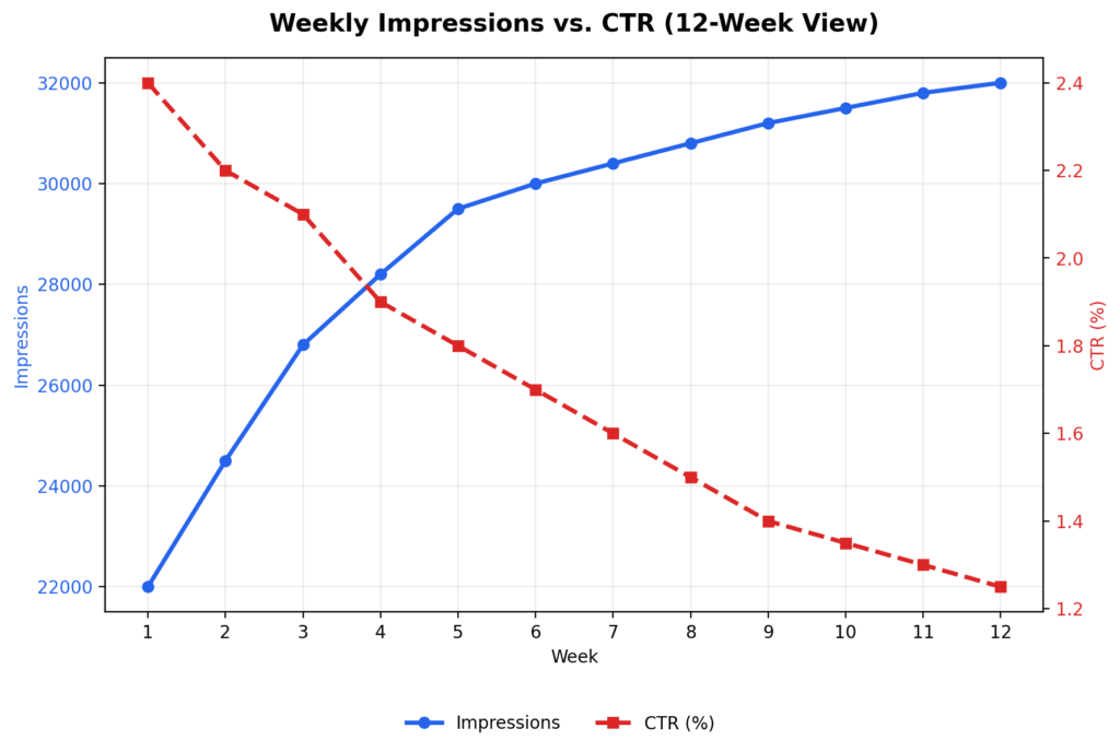
We changed the title tag and meta description. Nothing else. Clicks moved up within three weeks. The lesson wasn’t “visualize your data” as a slogan — it was that a declining CTR next to flat rankings is a specific, fixable diagnosis, and you can only see that shape by plotting it.
Three Views That Actually Change Decisions
Not every chart earns its place in a report. These three consistently do, because each one answers a question a raw export can’t.
A weekly (not monthly) trend line for impressions vs. CTR. Monthly aggregates smooth out exactly the inflection point you need to see. If impressions are climbing while CTR falls, you have a snippet problem. If both are falling together, you likely have a ranking or relevance problem. Same underlying metrics, opposite diagnosis, and monthly views blur the difference.
A device-split table, not just a device pie chart. Pie charts are good at showing you that mobile is “a smaller slice” — they’re bad at showing you it’s underperforming. What matters is CTR per device, side by side:
| Device | Clicks | CTR |
| Desktop | 2,100 | 4.5% |
| Mobile | 1,200 | 1.8% |
Desktop CTR here is more than double mobile’s. That’s not a traffic-mix issue, that’s a mobile-experience issue — page speed, font size, how the meta description truncates on a small screen, whether the H1 is visible without scrolling past an ad.
A ranking-band breakdown, not a full keyword list. Nobody can act on 400 individual keyword rows. Bucket them instead:
| Position range | Keyword count |
| 1–3 | 18 |
| 4–10 | 46 |
| 11–20 | 105 |
105 keywords sitting on page two is the single most actionable line in most Search Console accounts, and it’s completely lost inside a 400-row export. Those keywords usually don’t need new content — they need stronger internal links, a more complete answer to the query, or a title rewrite. That’s cheaper than producing new pages from scratch, and it’s the first place I’d look before writing anything new.
When the Content Is Fine But the Targeting Isn’t
An article titled “Best Budget Laptops for Students” sat at 18,500 impressions, 320 clicks, a 1.7% CTR, and position 8.4 after two months — numbers that read as “mediocre but not broken.”
Breaking the same data down by week and by query surfaced three things a summary row hid: impressions were rising steadily, mobile CTR was well below desktop, and a meaningful share of clicks were coming from phrases the article never explicitly targeted — “affordable student laptops,” “cheap laptops for online classes.” That last point mattered most: the article was ranking for demand it hadn’t written for, and a quick pass through the data turned up several low competition keyword opportunities that hadn’t been part of the original plan.
The fix wasn’t a rewrite. It was a new H1 that matched the actual searched language, an FAQ section built around those discovered queries, a mobile speed pass, and a couple of internal links from related posts. Forty-five days later: clicks went from 320 to 810, CTR from 1.7% to 3.9%, average position from 8.4 to 5.2. The content barely changed. The targeting did, because the data showed us what to target.
Where to Build This
You don’t need enterprise tooling to do any of the above:
- Google Sheets with a pivot table and a couple of
QUERYformulas handles the ranking-band breakdown and device split for most sites. - Looker Studio is worth setting up once you want this refreshing automatically instead of rebuilt by hand each week — connects directly to Search Console.
- Excel or Power BI make sense once you’re managing several sites or need to combine Search Console with GA4 and server log data.
Start in a spreadsheet. Move to Looker Studio when rebuilding the report manually becomes the bottleneck, not before.
The Actual Workflow
- Pull weekly (not monthly) Search Console data.
- Chart impressions and CTR together, not separately.
- Break rankings into bands instead of scanning a full list.
- Split performance by device.
- Look for the mismatch — rising impressions with falling CTR, strong desktop with weak mobile, page-two keyword clusters — and treat that mismatch as your to-do list.
- Make one change per finding, then re-check the same chart in three to four weeks.
The point of any of this isn’t a nicer-looking report for a stakeholder meeting. It’s that “how many clicks did we get” is the wrong question — the useful one is “what does the shape of this data say we should do next,” and that question only gets answered by something you can look at, not just export. This matters even more for SEO strategies for new websites, where traffic is low enough that a single row of numbers hides almost everything — a small trend is often the only signal you’ll get before it becomes a bigger problem.
Final Thought
None of the fixes described here were dramatic. A title tag. A meta description. An FAQ section built around three phrases someone actually searched. A mobile speed pass. Nothing that required a content overhaul or a bigger budget — just a change that came from noticing a shape in the data that a summary row would never show.
That’s the actual argument of this piece, stripped of the tooling talk: most Search Console accounts aren’t short on data, they’re short on a way to see it. The 105 keywords stuck on page two, the mobile CTR quietly running at a third of desktop’s, the impressions climbing while clicks slide — none of that is hidden information. It’s sitting in the export right now. It just doesn’t look like anything until it’s plotted.
So the practical test for whether any of this is worth doing isn’t “does this look better in a report.” It’s simpler: pull one chart this week, find one mismatch, make one change, and check back in three or four weeks. If nothing moves, the diagnosis was wrong and you look again. If something does, you’ve just found the fastest kind of SEO win there is — the one that was already ranking, and just needed someone to notice.
FAQs
What is data visualization in SEO?
It’s the practice of turning raw Search Console exports — rows of clicks, impressions, and positions — into charts, tables, and breakdowns that make patterns visible at a glance. The value isn’t aesthetic; a well-chosen chart can surface a mismatch (like rising impressions paired with falling CTR) that would otherwise stay buried in a spreadsheet for months. Most SEO problems aren’t hiding — they’re just hard to see in tabular form.
Why is Google Search Console useful?
Beyond the standard clicks-and-impressions overview, Search Console is one of the only tools that shows you the exact queries triggering your pages — including ones you never targeted, which is often where hidden traffic opportunities live. It also breaks performance down by device and country, which matters because a page can look “fine” in aggregate while badly underperforming on mobile specifically. The catch is that none of this shows up until you segment the data yourself; the default dashboard view hides almost all of it.
How does a pie chart help in SEO — and when does it not?
A pie chart is useful for a single purpose: showing relative share, like what percentage of total clicks come from mobile versus desktop. Where it fails is comparing performance — two slices can look similar in size while one device converts at 4.5% CTR and the other at 1.8%, and a pie chart will never show you that gap. For anything involving a rate or a comparison rather than a proportion, a bar chart or side-by-side table will surface the actual problem faster.
Which SEO metrics should I actually track weekly, and why weekly?
Impressions, clicks, CTR, average position, and query-level data all matter, but the cadence matters just as much as the metrics — monthly averages smooth out the exact inflection points where a ranking problem turns into a click problem, or vice versa. A page can hold a stable monthly average while quietly bleeding CTR every single week underneath it. Pulling data weekly is what makes that kind of decline visible before it compounds into a bigger drop.
Which tools are best for SEO data visualization, and how do I choose?
Start with Google Sheets and a pivot table if you’re managing one or two sites — it’s enough to build a ranking-band breakdown or device split without any setup cost. Move to Looker Studio once manually rebuilding the same report every week becomes the actual bottleneck, since it connects directly to Search Console and refreshes automatically. Excel or Power BI make sense at a larger scale, mainly when you need to combine Search Console data with GA4 or server logs rather than for the visualization itself.
Can data visualization actually improve traffic, or just reporting?
Yes, but only if it changes a decision — visualizing data that doesn’t lead to a specific action (a title rewrite, an internal link, a mobile speed fix) is just a nicer-looking report. In the examples in this piece, the charts didn’t create traffic on their own; they revealed a fixable mismatch — a title problem, a mobile gap, an untargeted keyword cluster — and the traffic gain came from acting on it within days. The chart is a diagnostic step, not the fix itself.